
Branding and Custom Website Designs
With so many land service companies in the US, Pinson felt it was time for a rebrand to stand out amount the competition. I was tasked at Liquidfish to lead design on this brand refresh. This project even included a name update, which we only tweaked slightly to allow Pinson to still hold onto their current brand recognition.
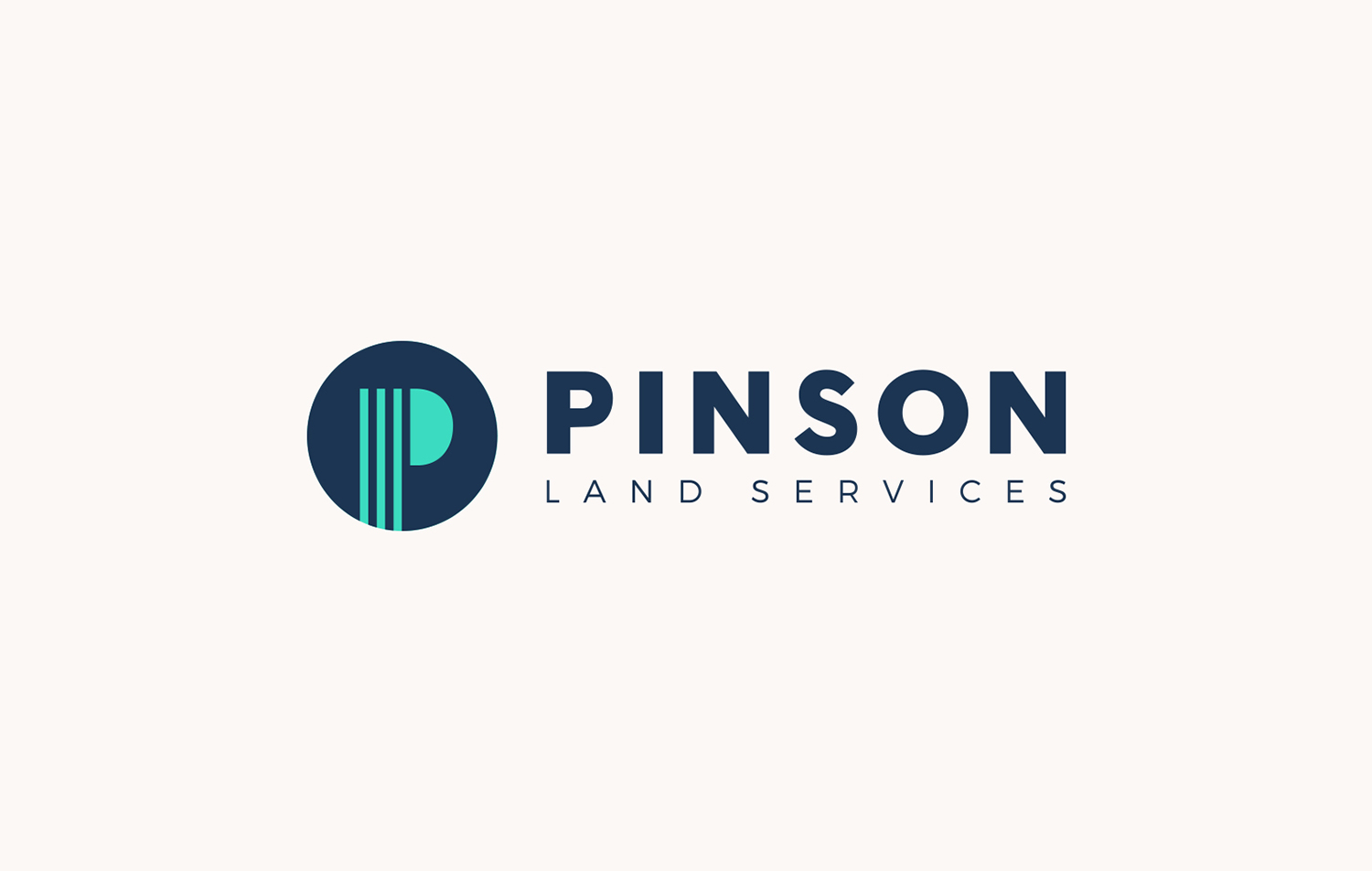
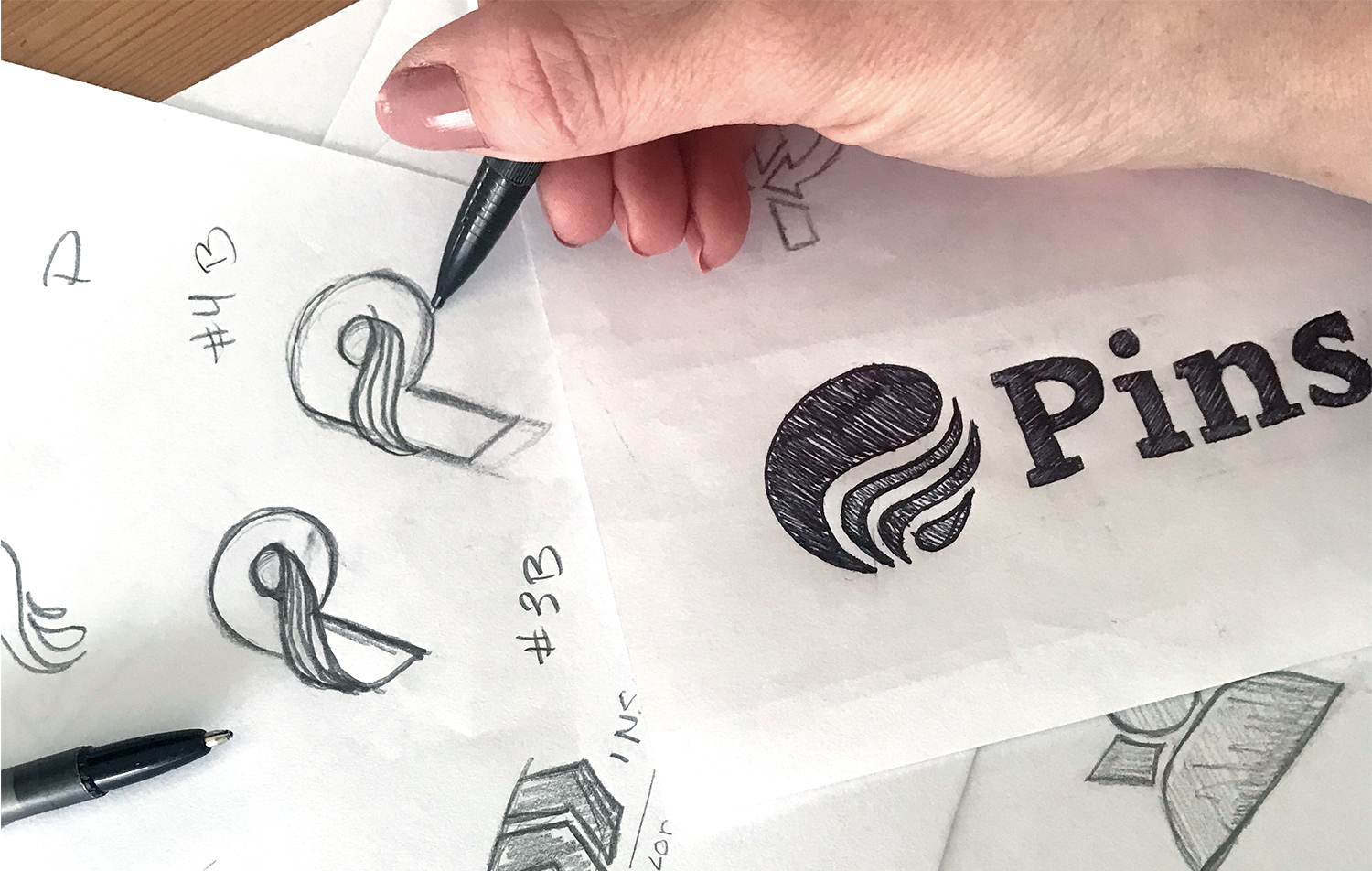
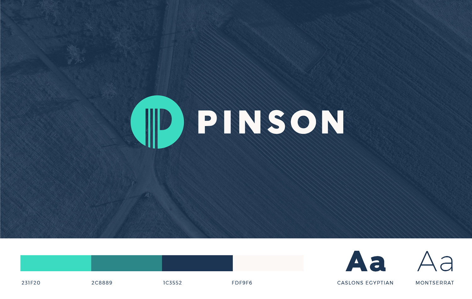
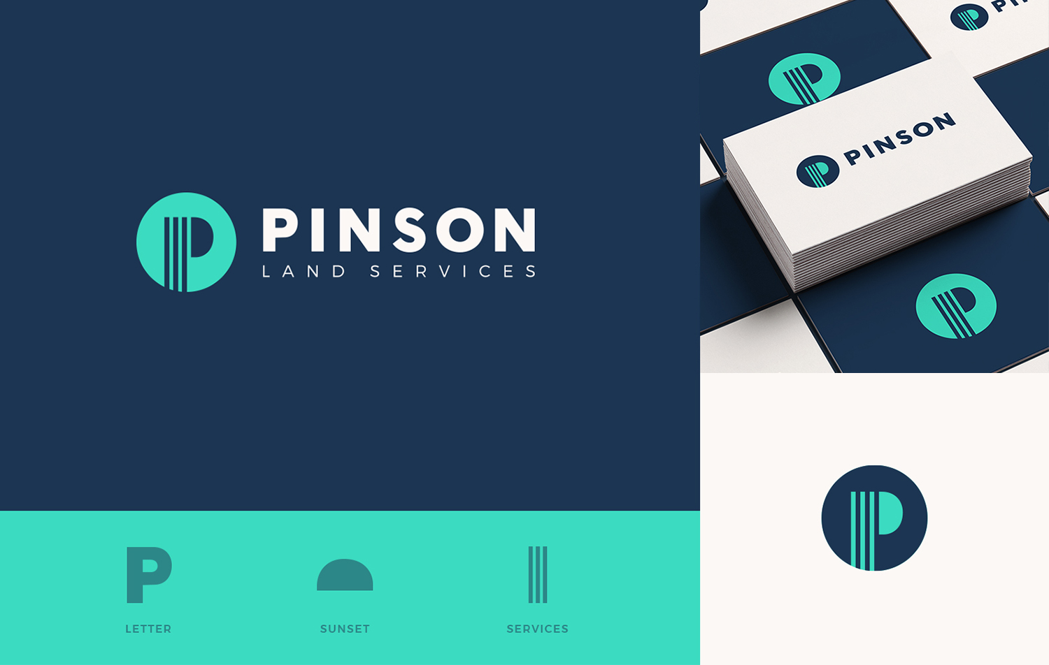
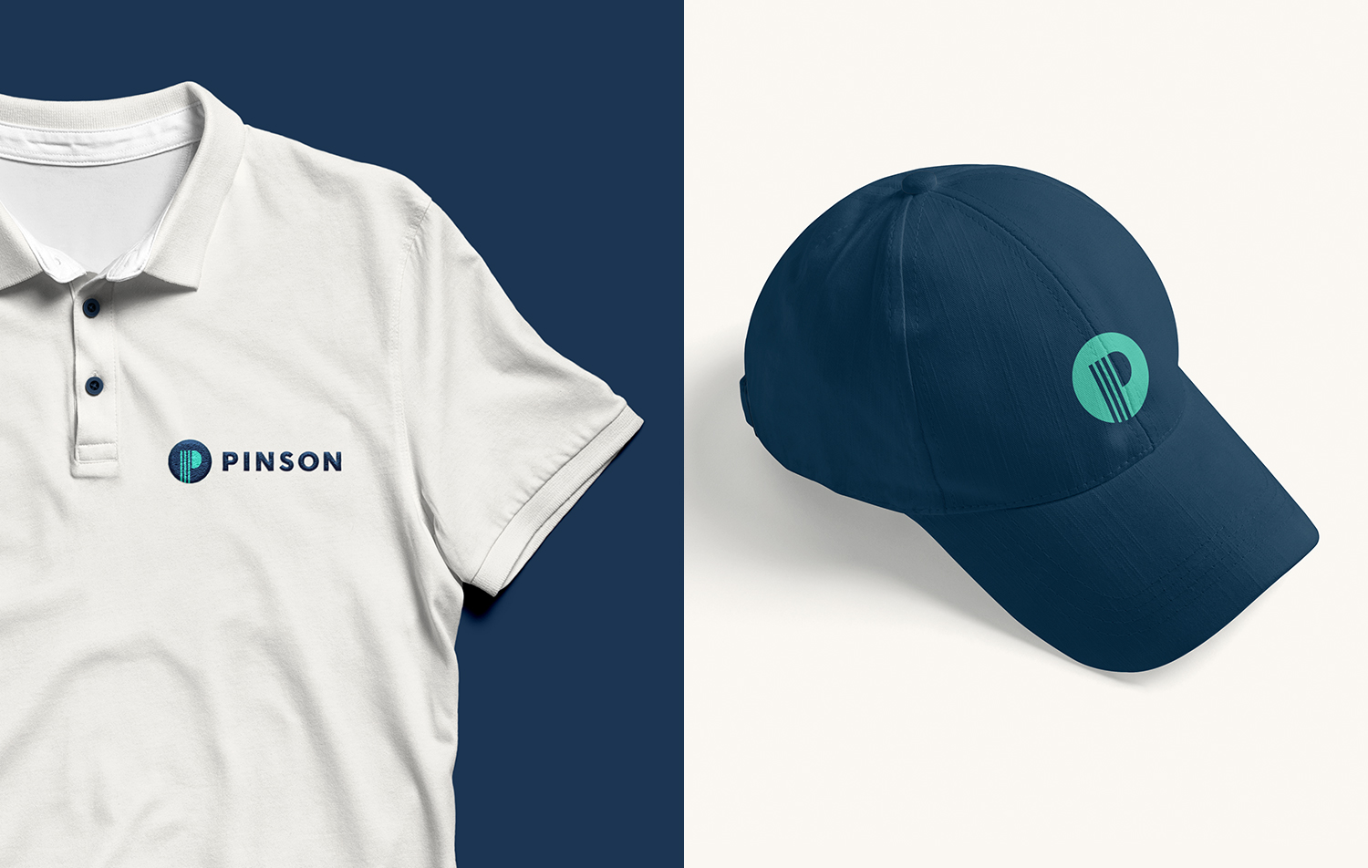
For a company that’s been around for a few decades, they surprised our team by gravitating to a more modern style for their logo. After learning about some of their core values, I was able to tie a few of these concepts into elements in their logo in an abstract way. The final logo and colors definitely bring this reputable energy company into the new tech age.
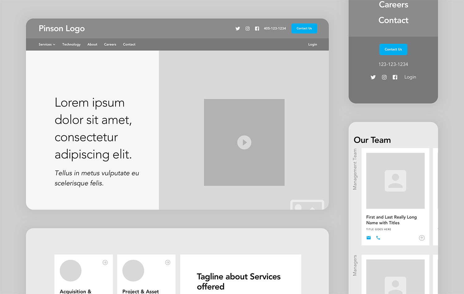
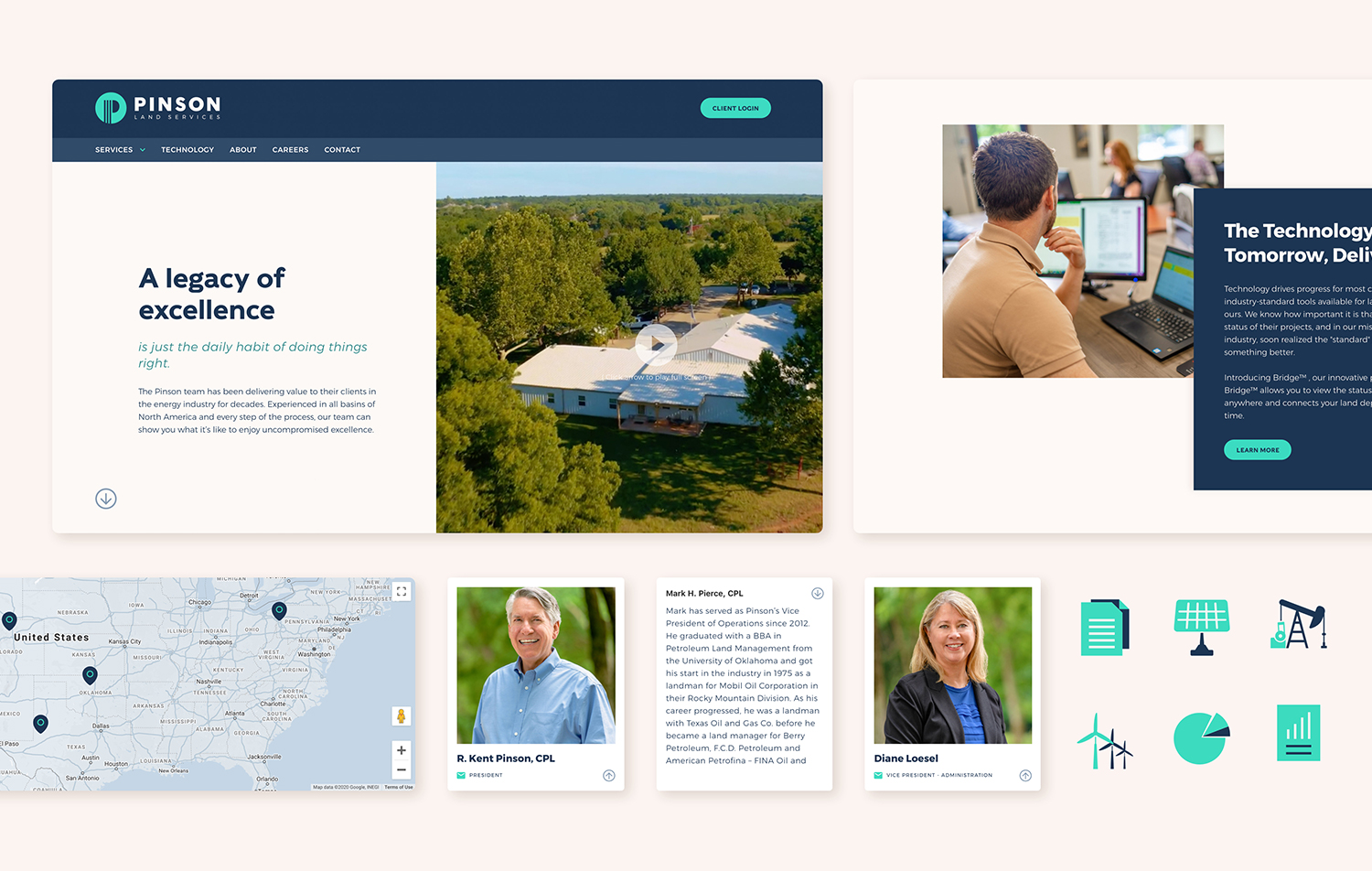
To make the Pinson brand update complete, the Liquidfish team shot a short informational video and some various photography for the website. I then combined all of these brand assets on a custom designed and built website for the world to see on Webflow. The goal was to unify the Pinson name, update the brand, and make it more accessible to a younger oil and gas audience. I think our team was able to accomplish just that. Check out the live site here to see for yourself.
Lead Designer, UI/UX, Webflow Development