
Restaurant & Patisserie Branding
The Backstory:
The award-winning Chef Andrew Black is a returning client of liquidfish. His restaurant concepts range from 12 course meals to quick french inspired lunch spots. Each restaurant is a highly curated experience in itself. Chef Black is planning on opening up a new concept that he is hoping will be not only be locally renowned, but also scaleable and recognizable on a global level.
The Brief:
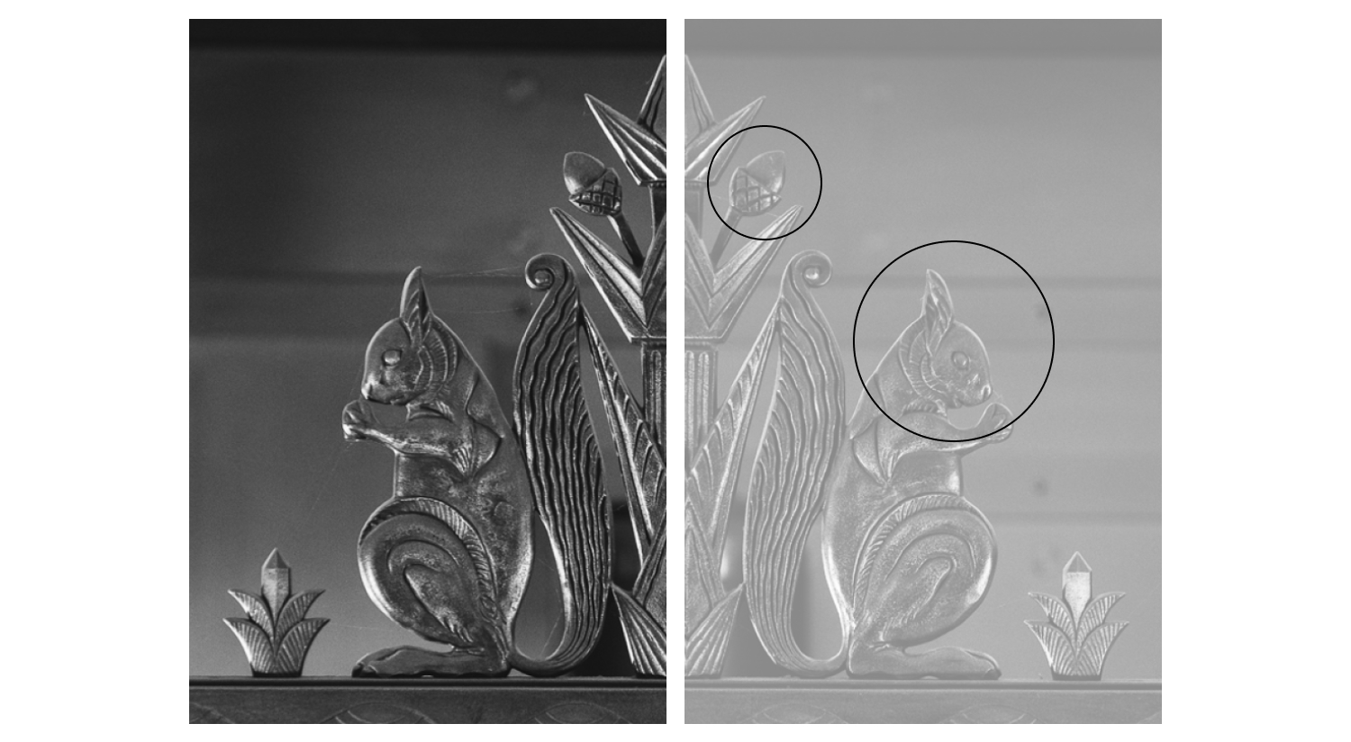
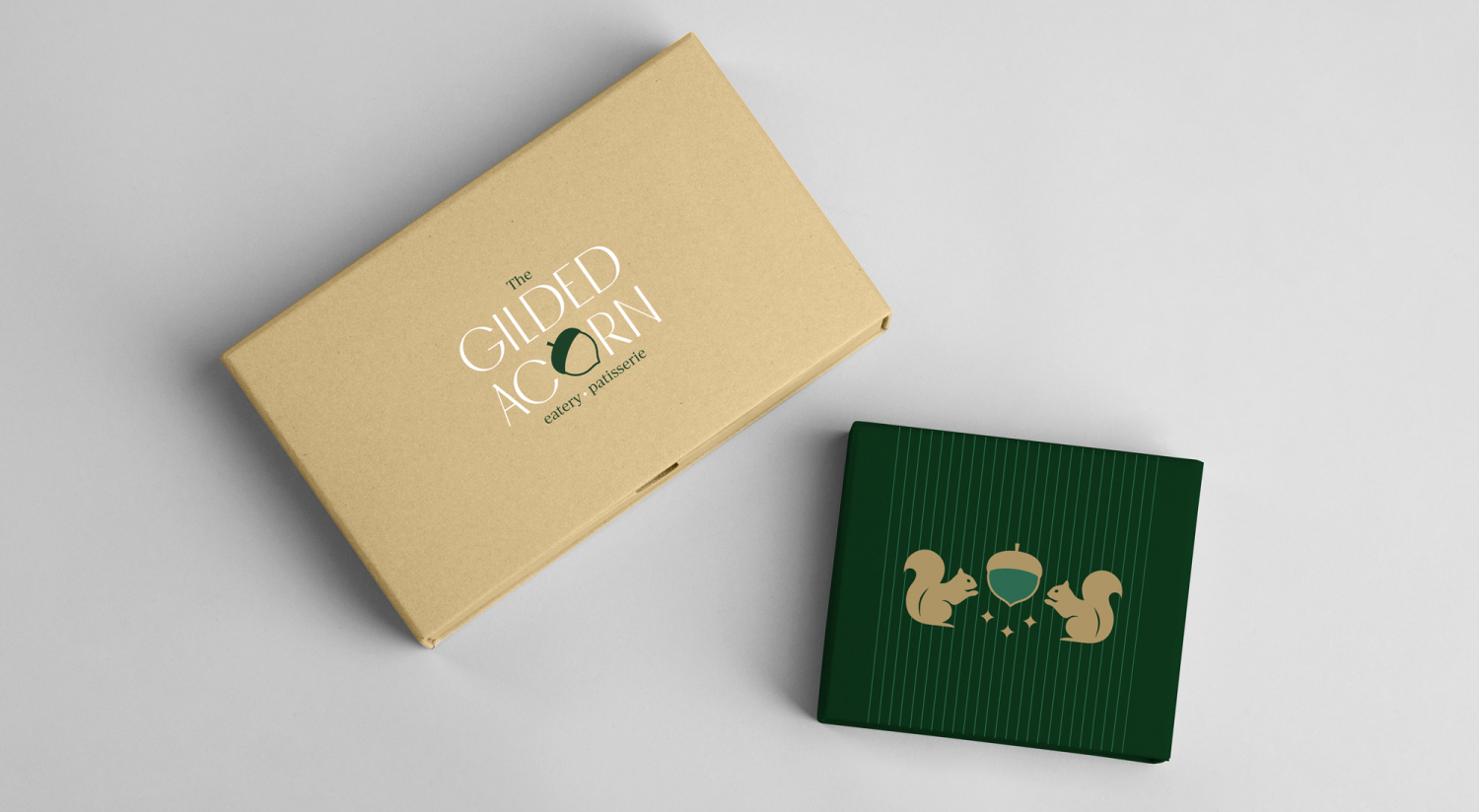
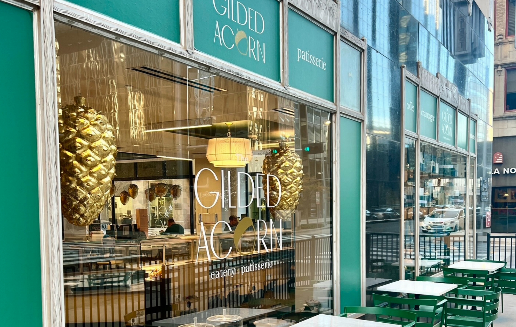
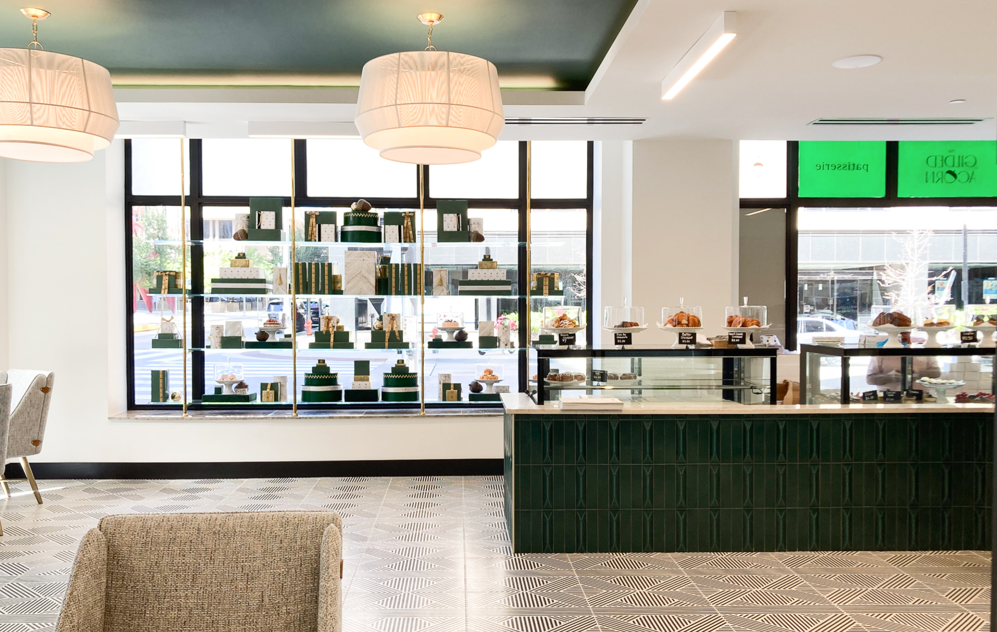
The First National Bank skyscraper remodel in downtown Oklahoma City presented chef with the perfect space and opportunity to bring something elegant and unique to the city. With a luxury hotel and multiple high-end restaurants being developed inside the building, Chef wanted to add an iconic corner restaurant. This place would be fancy enough to stop in for an oyster and champagne lunch toast or grab a fancy pastry to-go. He wanted the brand to be iconic in aesthetic (he mentioned Tiffany with its trademark blue and window displays) and evocative enough for people to stop in. The brand needed to be scaleable, not just for the restaurant, but also for high-end custom packaging as well. Another key element Chef Black wanted us to take inspiration from was the building. The 1930s Art Deco / Art Nouveau style of building included stylized creatures spread throughout. He particularly liked the squirrels that ran throughout the building. He thought it might be nice to nod to the history of the building.
The Process:
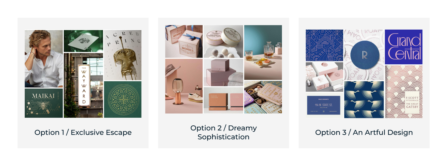
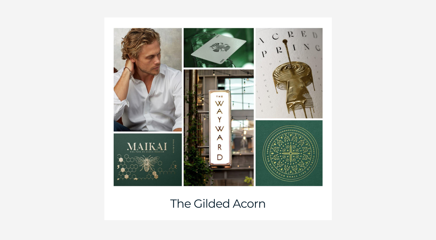
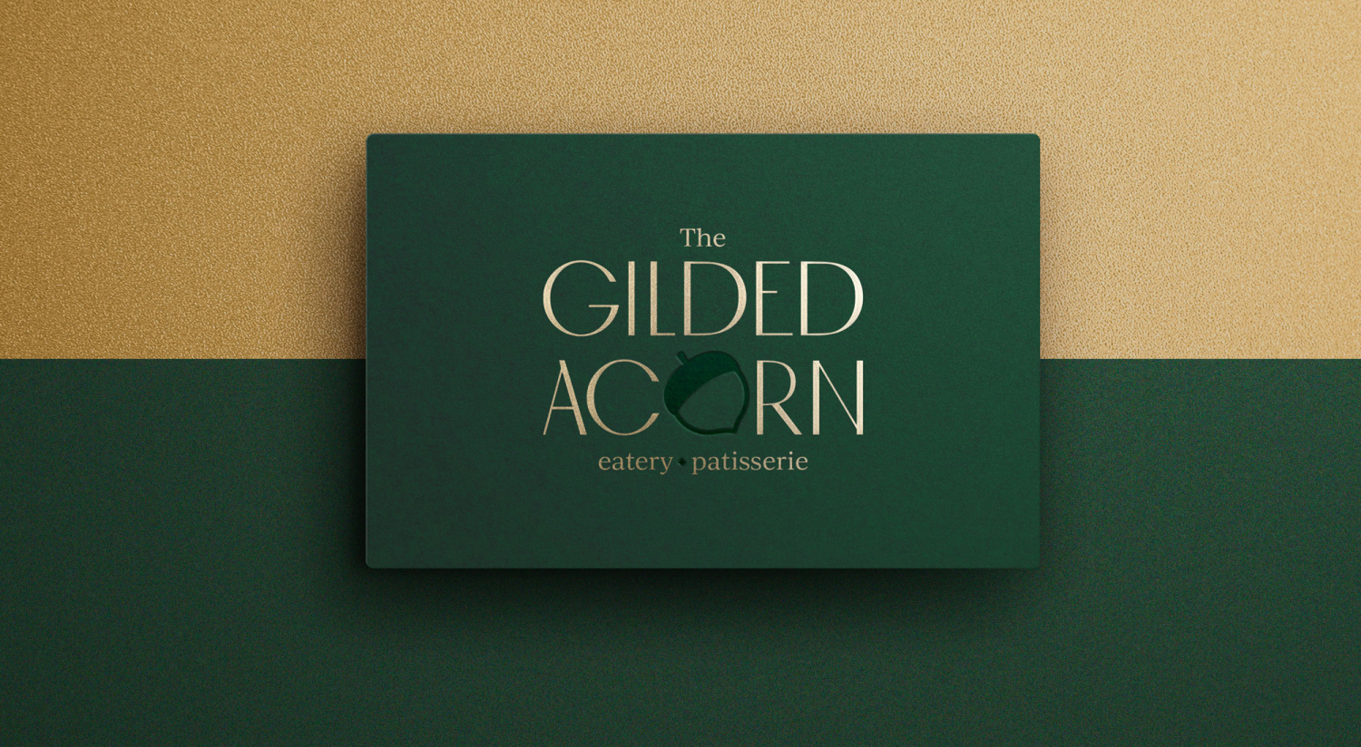
To start off with some fresh ideas for concepts, we had a creative team brainstorm with the client. I lead this meeting with prompts to help us ideate. This meeting turned up some great ideas, but it mostly surfaced a better idea of what Chef was looking for. From there, I curated 3 different concepts from my notes on the brainstorm that I wanted my team (2 designers, 1 design intern, and copywriter) to explore. They came up with 3 distinct mood boards and rationale. The winning concept was named "Exclusive Escape". The concept was inspired by the history of the building being a bank, using rich greens and gold. The restaurant and the experience of being there would be feel exclusive, like a secret high-end society. It is the hidden gem. From there, many naming options were presented. The Gilded Acorn was landed upon. This tied in the squirrel reference and the mood board feel chosen well.
With the direction approved, one of the designers and I split off in designing out 2 different brand options. As we designed, we made sure to check-in to make sure we kept the concepts different enough. My design was the winning chosen concept. Below is the rationale for it.
The Result:
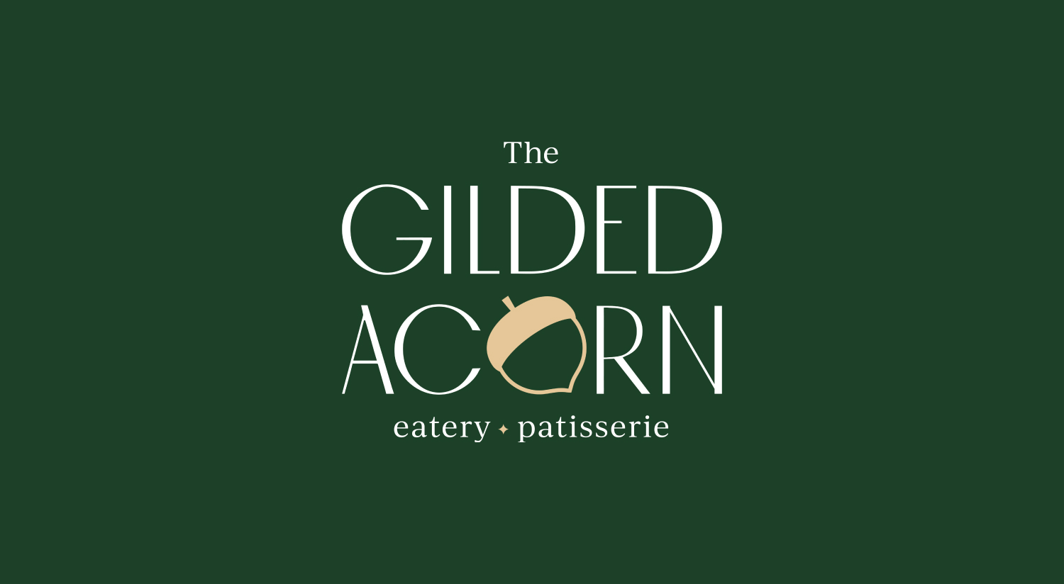
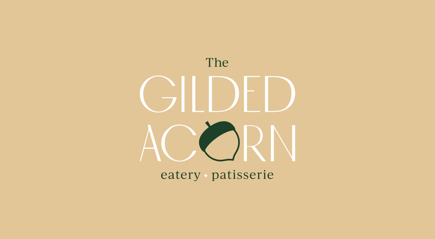
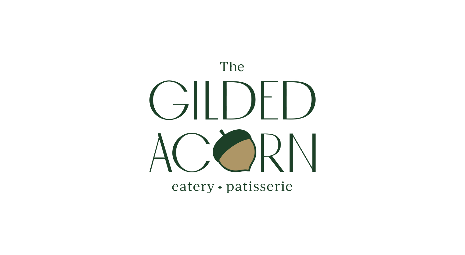
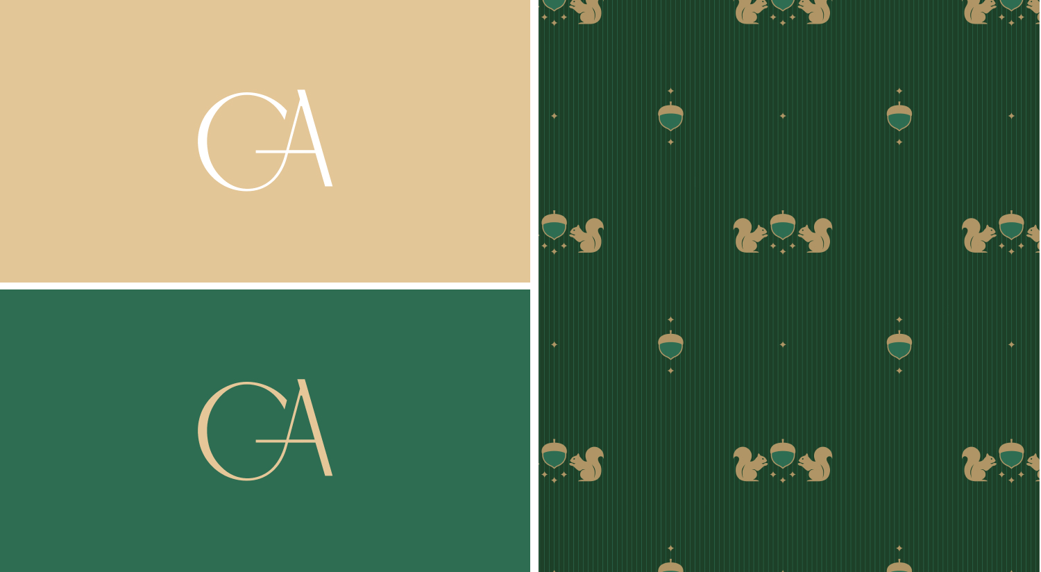
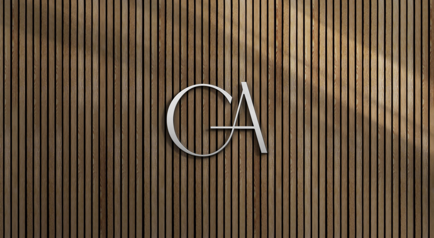
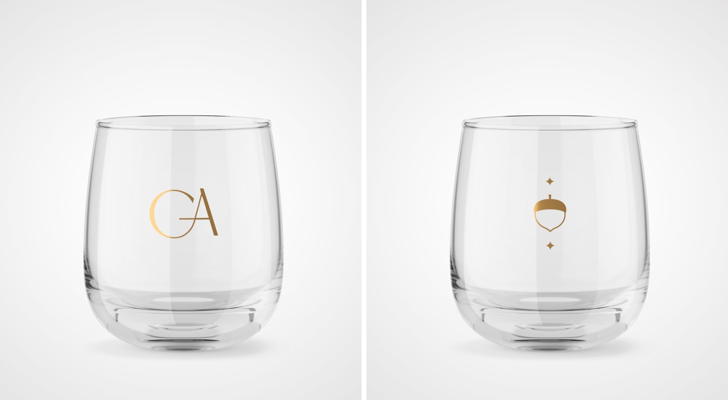
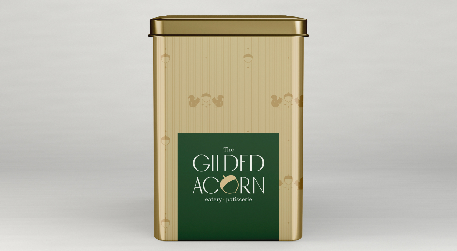
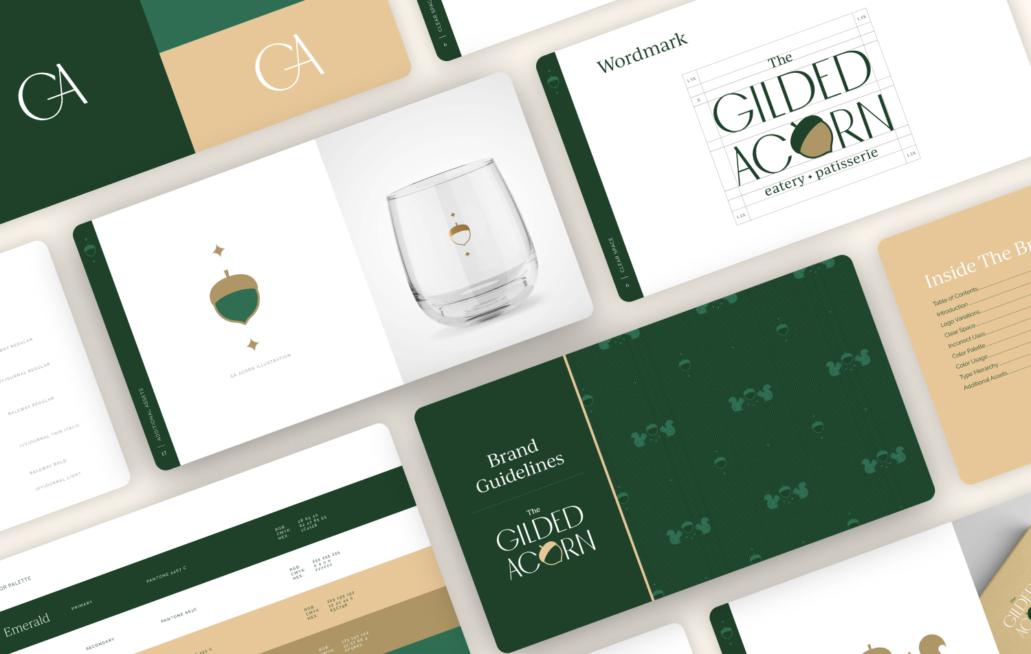
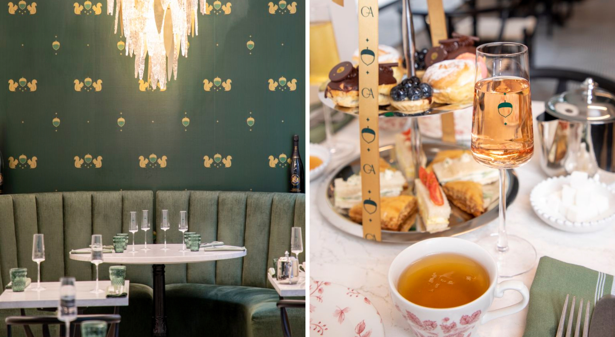
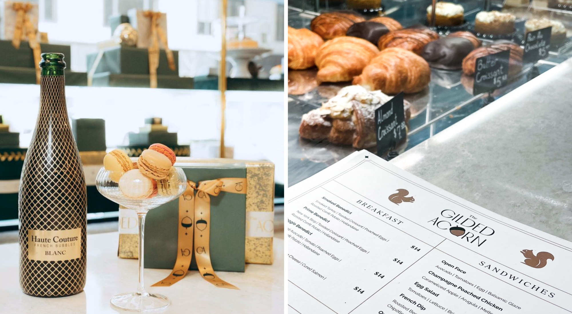
Drawing inspiration from the physical elements and history of the building, we chose the acorn as the corner element of the brand. The squirrel, being an intricate piece to the architecture of this building, is also incorporated into design patterns and other brand assets, acting as a supporting character within the brand. In order to create brand recognition, we simplified each of these shapes for easy recognition and replicate throughout the brand’s designs.
For this logo, we picked a high-contrast san serif font that nods to the Art Deco age, but still provides an elegant and timeless look. Incorporating the acorn within the “O” of the logo in a subtle yet memorable way to emphasize that the acorn is the treasure within this exclusive space. The subfont around the logo serves as an accent piece to the title, adding a sense of timelessness to the primary logo.
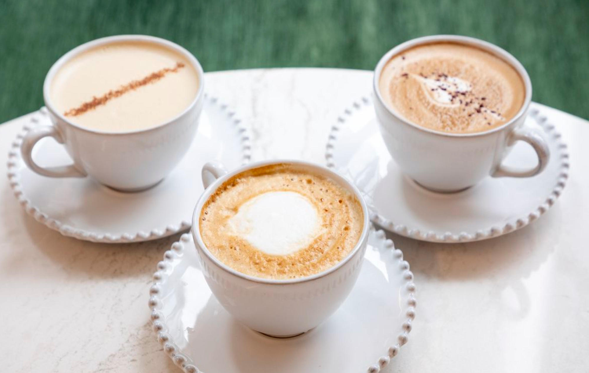
The color palette of this design incorporates rich emerald greens, mixed in with teal tones in order to create a decorative feel. This richness gives the brand depth and creates a foundation for a luxury feel both online and in the restaurant.
The definition of gilded is “to be covered thinly by gold leaf or gold pants.” Playing into this idea, the muted gold colors add variety to the richness of this color palette. Gold metallics will also be incorporated into the brand when there’s the ability to do so, specifically in packaging and interiors. Golds can serve as accents within the brand--a lux and treasured touch that elevates the brand.
White is also a significant color in this concept, as it provides a sense of modernity and contrast to the palette. The variety of dark and light alludes to the eye-catching contrast of many high-end brand palettes. Pairing white (and even light gold) and dark emeralds gives the flexibility the brand needs to either set a mood with a darker scene or provide a blank canvas of light colors/white to highlight products and experiences.
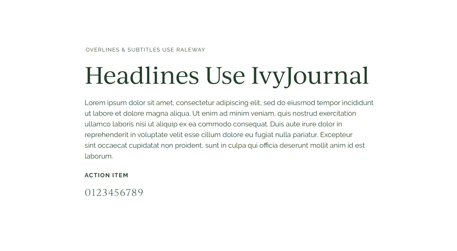
For the headers, we chose IvyJournal, a more timeless serif with a modern twist. For paragraphs and subtitles, we chose the modern san serif Raleway, which also has a slight touch of Art Deco. By mixing timeless and modern sans serif fonts, we create a sense of regal meets modernity. Fonts outside of the logo are seen as an accent, creating a sense that The Gilded Acorn is the main, exclusive destination.
Creative Director, Art Director, Lead Designer