
Floral Company Branding
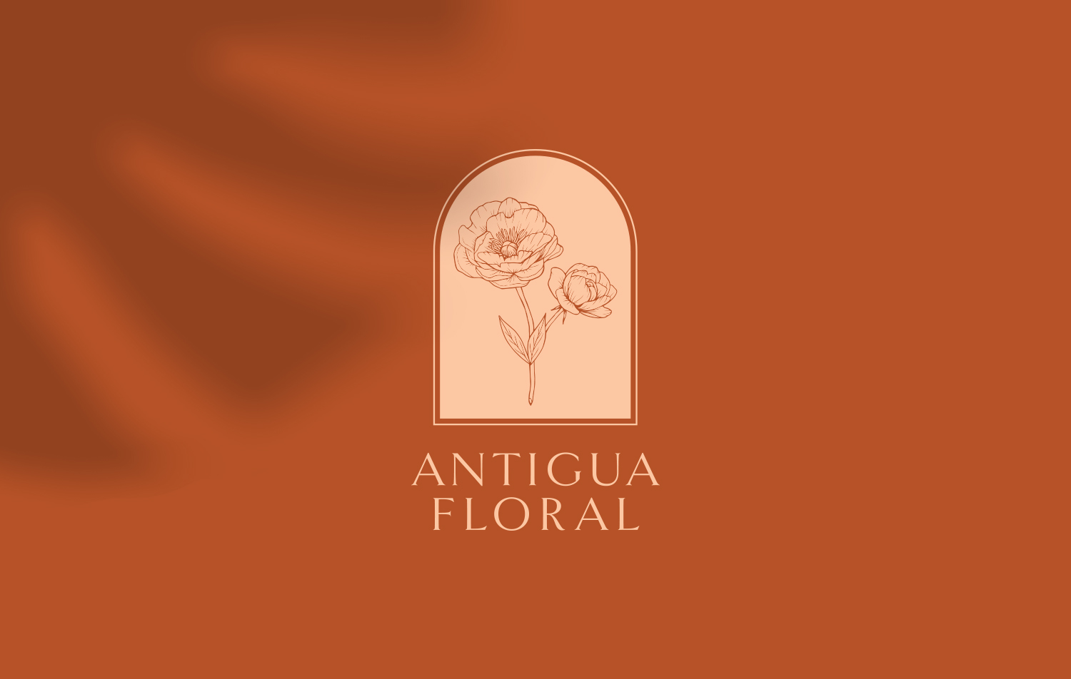
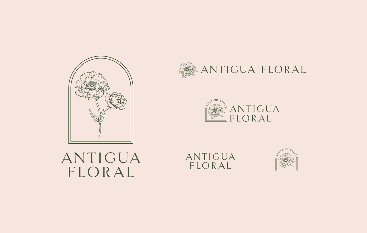
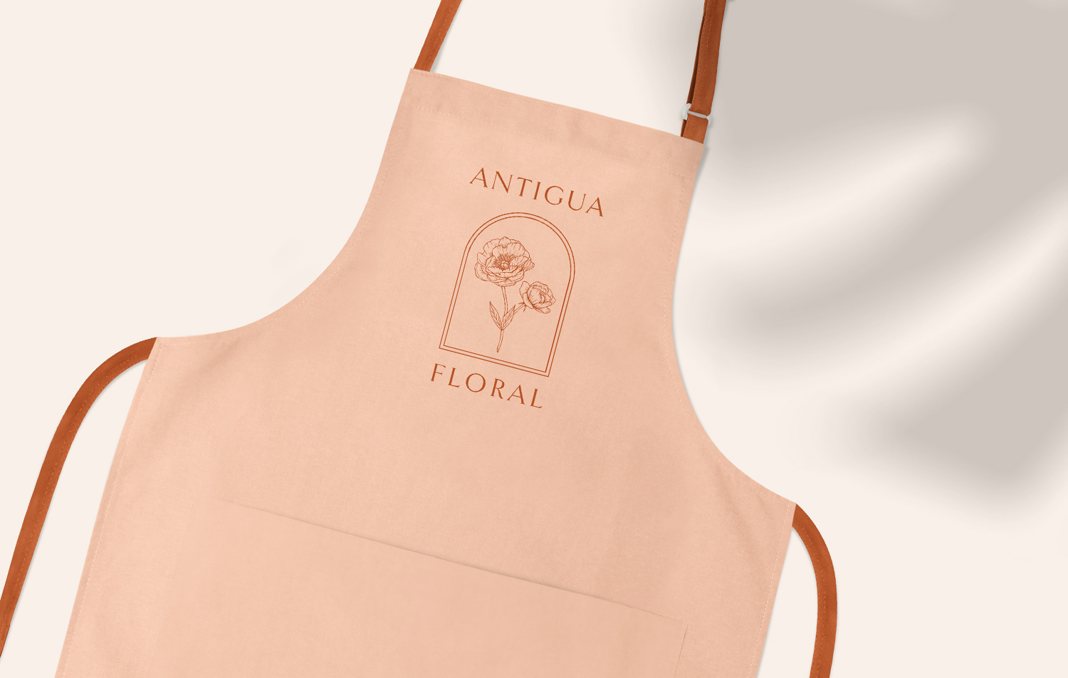
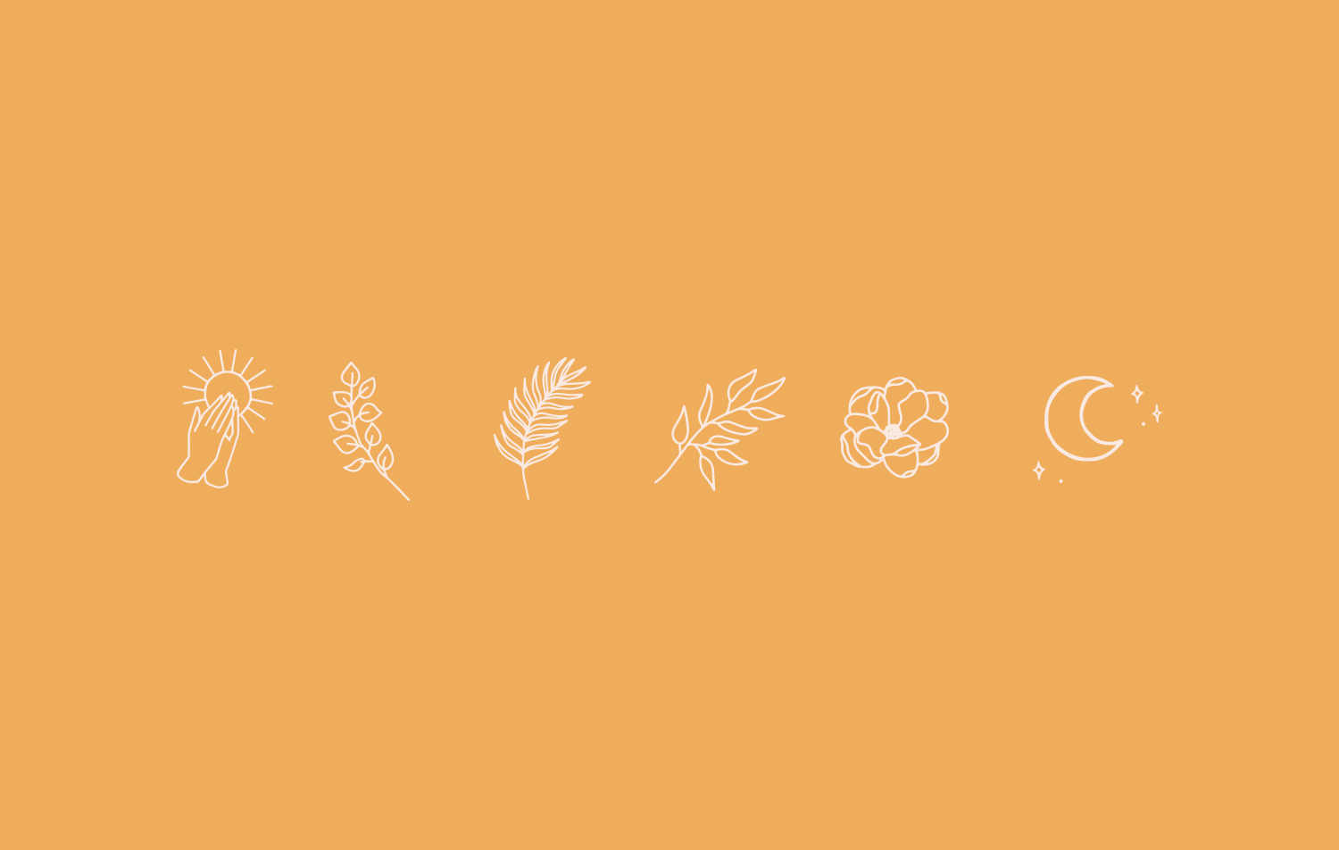
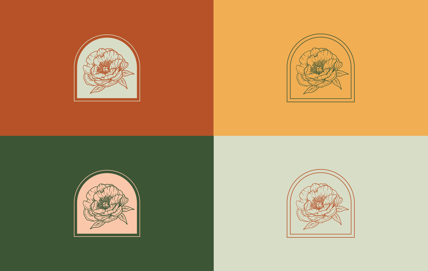
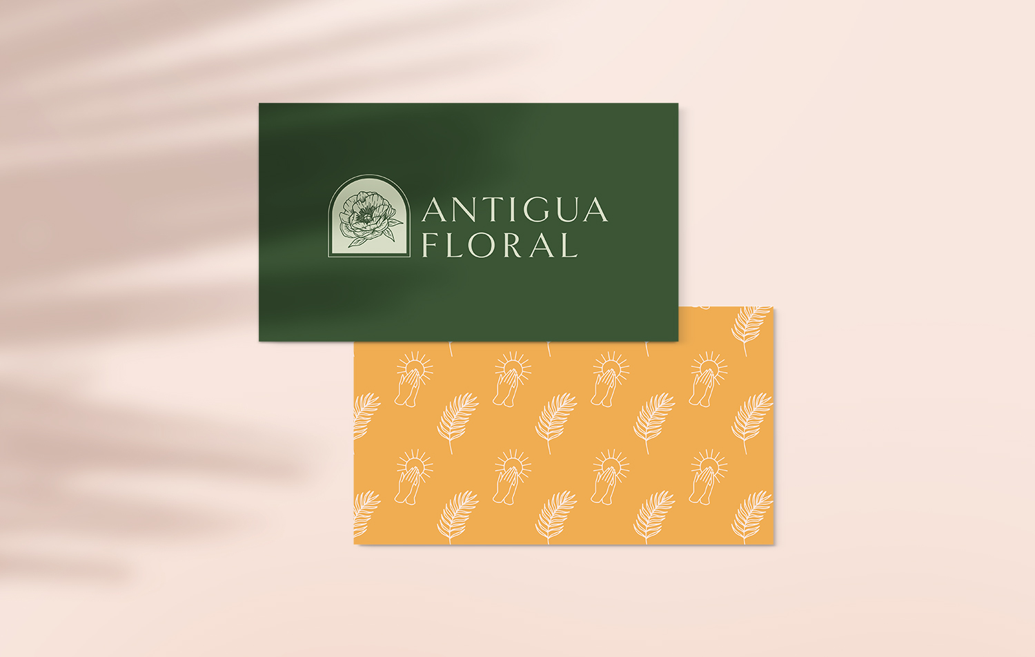
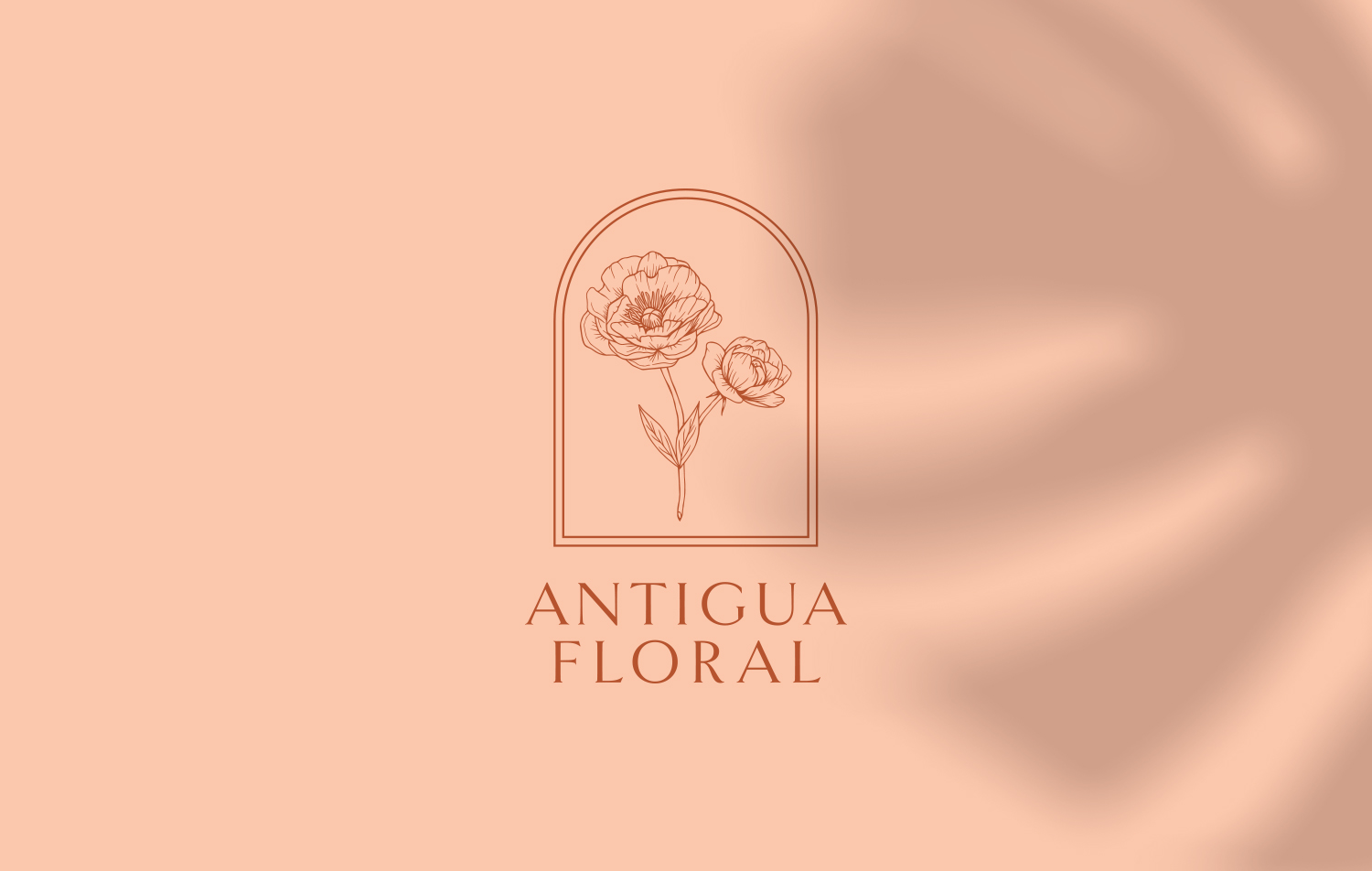
Antigua Floral, a wedding florist in New Orleans, approached me about a rebrand for their company this year. The business had grown and matured and the owner was hoping for a fuller brand identity to take them to that next level. Because of its playful, yet elegant floral style, Antigua Floral wanted brand elements that nodded to a timeless and energetic feeling (quite similar to New Orleans itself). Antigua Flora has a strong Latinx flare in its styling, seen in its bright color palettes and tropical plants. This originates from the owner's Salvadorian heritage and personal style. One last request from the owner was that the logo be based on a drawing purchased from her favorite tattoo artist. The drawing was of some beautiful hand drawn peonies, which are her favorite flower.
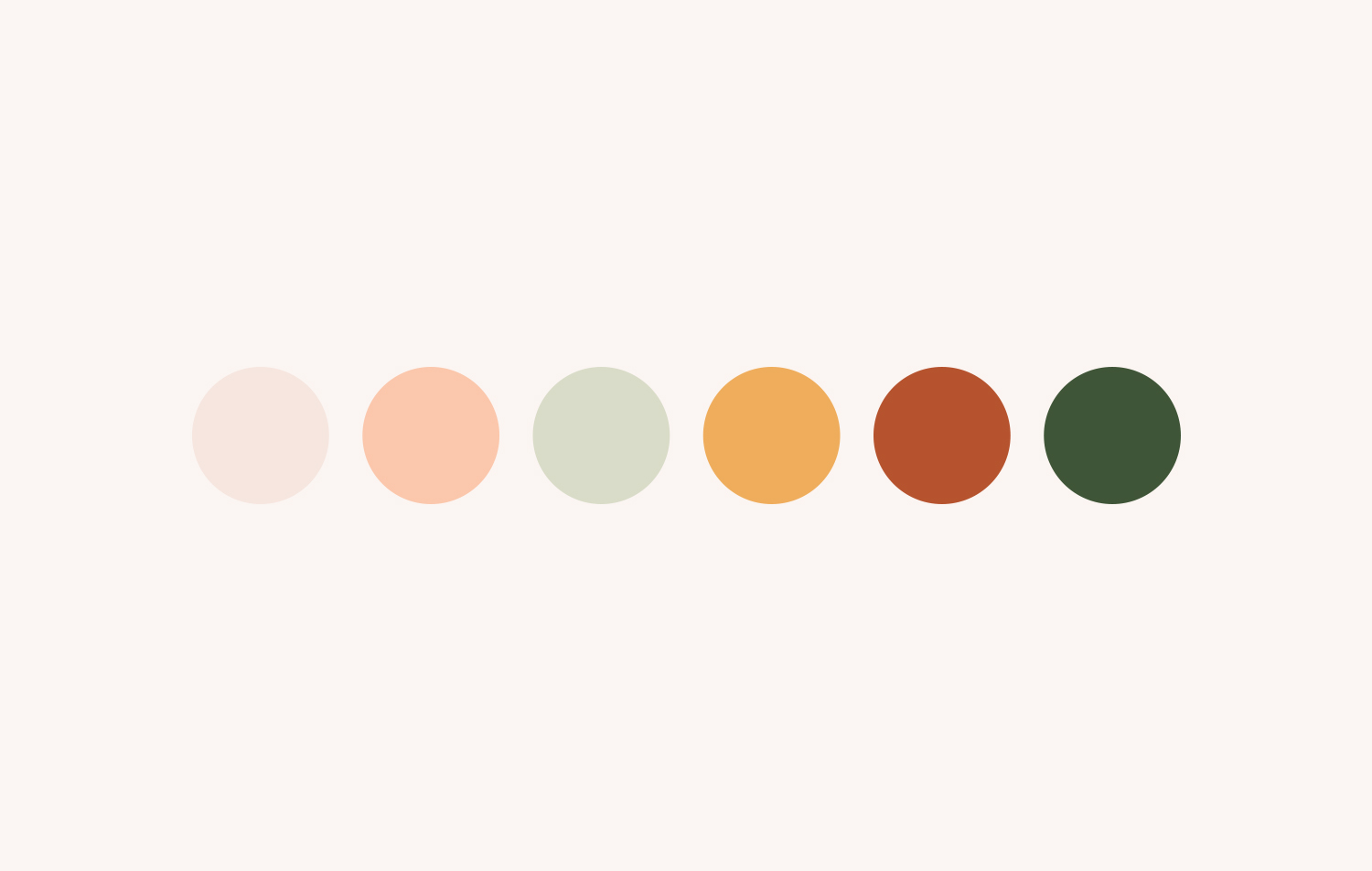
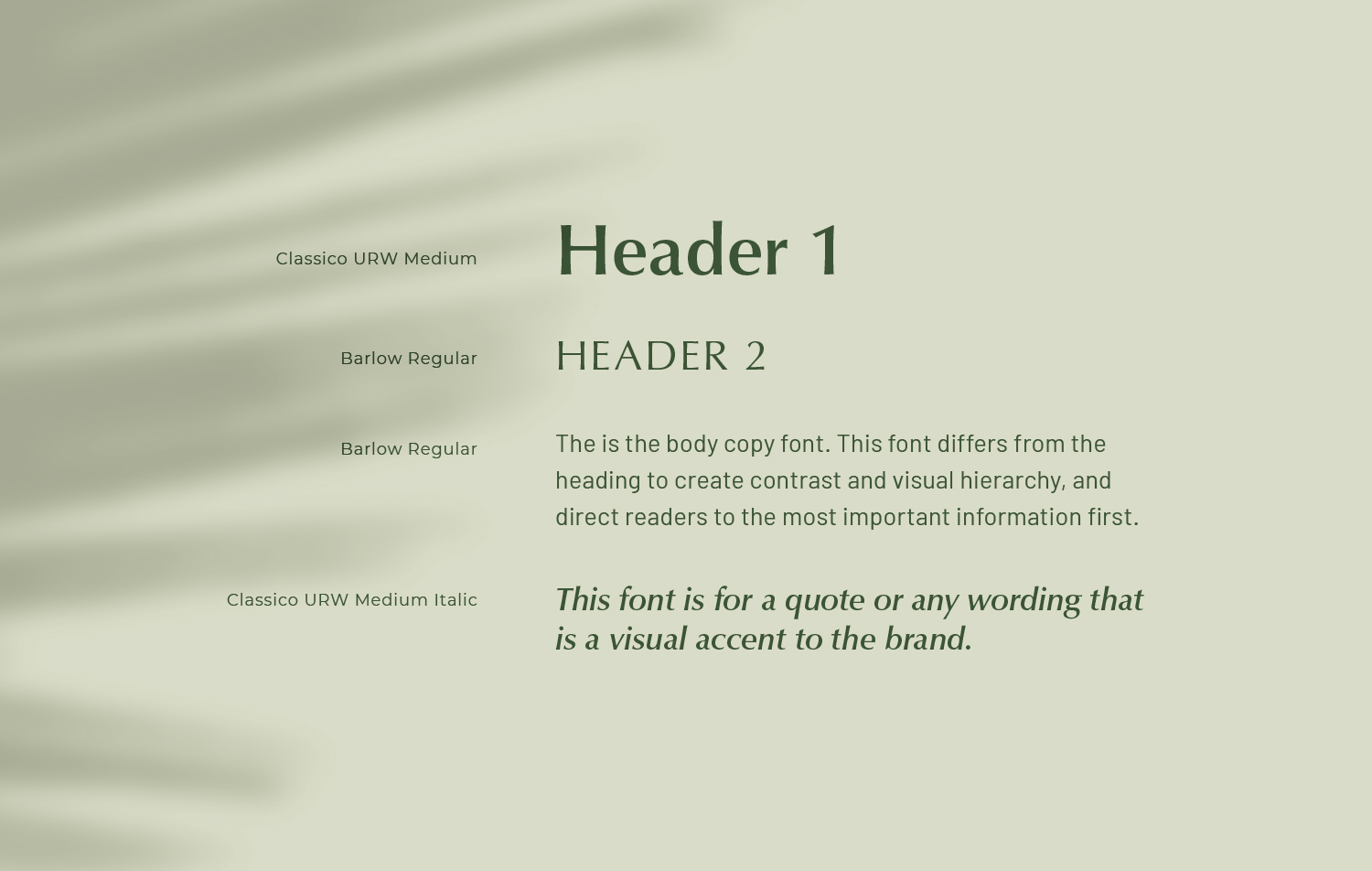
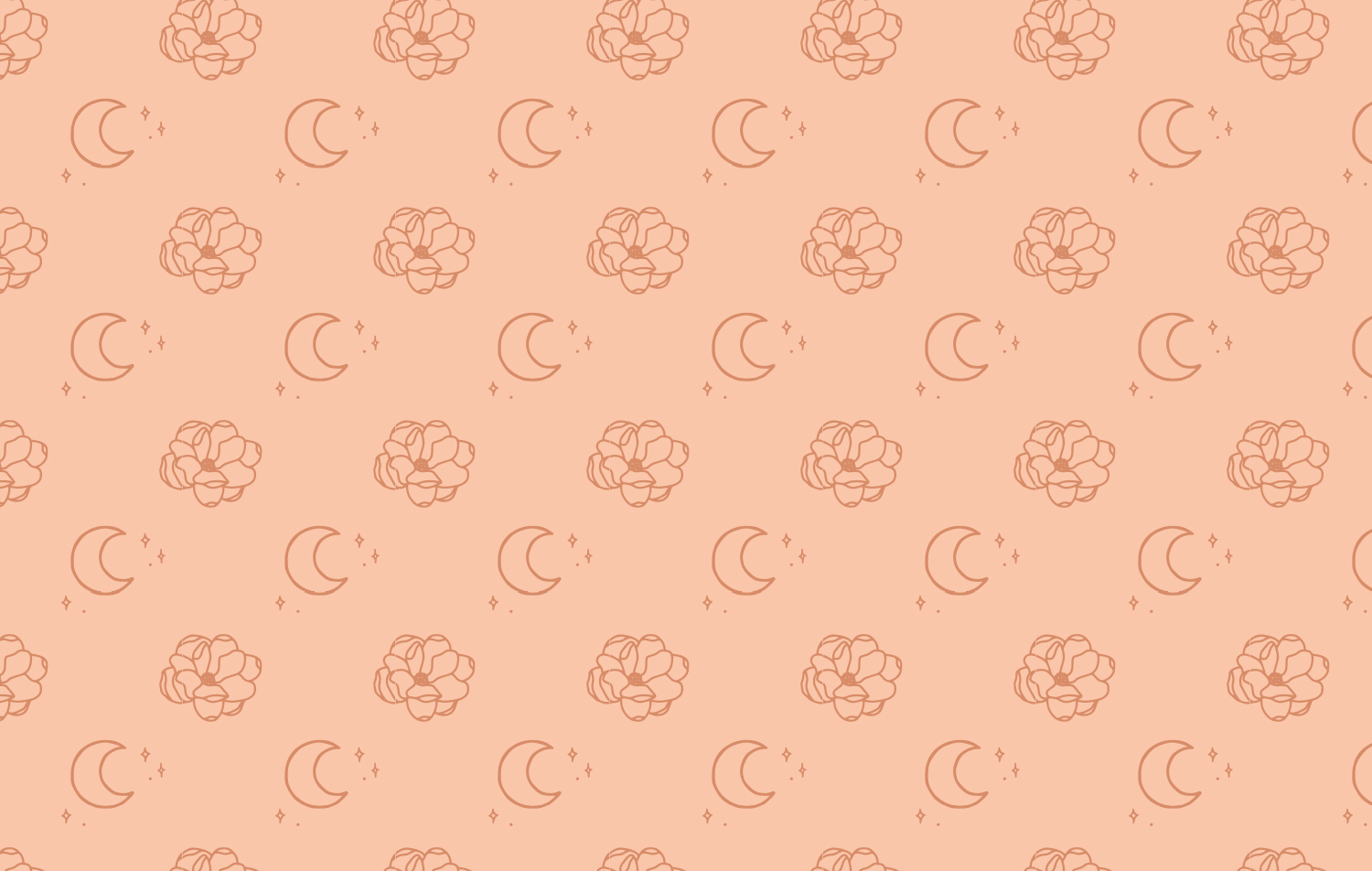
To say I was excited for this type of project would be an understatement. This feminine forward design was right up my design alley. With all of the inspiration and and detailed requests laid before me, I was able to create this new look for Antigua Floral. The vibe of the brand is quite sophisticated, but softened in seriousness through its lively colors, icons, and patterns. The drawn peonies were modified and simplified to make them more scaleable for logo variations. The color palette was balanced with bright hues and warm muted neutrals. I created some hand drawn icons in the same styles as the peonies, each icon representing details of New Orleans or specific florals Antigua uses. The font for the logo I chose was a trendier san serif high contrasted weight font, however the vintage vibe I believe will make it timeless. I made sure to include fonts from Adobe and Google in the rest of the brand system, so the client could have easy access to them when creating print materials and building the site. The owner of Antigua was thrilled with the overall brand reveal and is currently rolling out the brand launch.
Art Direction & Design